About the product
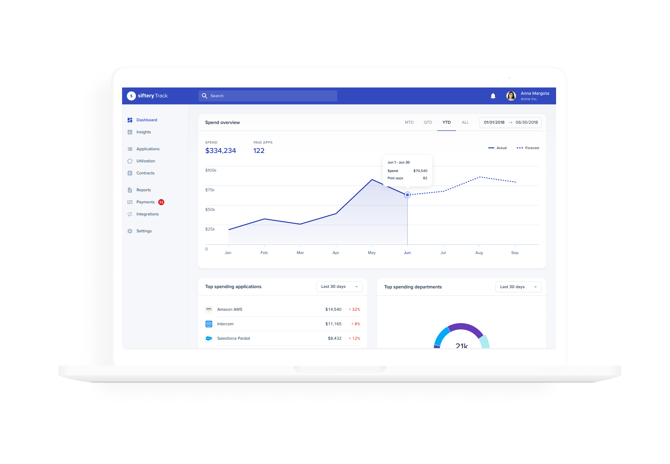
Siftery Track is a SaaS management web application that helps organizations streamline and optimize their internal software spend, utilization, and contract renewals. The product provides finance, IT, and operations teams with a unified tracking system to increase visibility and control of their company's SaaS environments and expenditures.
My role
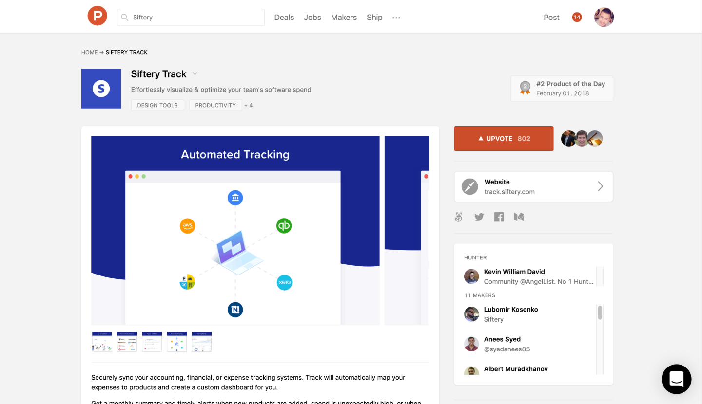
As one of the first designers in the Track team, my primary task was to design a new B2B cloud application from scratch. I led the end to end product design process from problem definition to our public launch. I worked directly with the CEO and engineers to help define and execute on a product roadmap that supports Siftery's broader go-to-market initiatives. Track launched in February 2018.
Main tasks
- Synthesized research findings to generate insights
- Gathered product requirements and proof of concepts
- Mapped out user flows and IA
- Designed interactions and UI components for Track’s core features
- Led post-launch iterations based on customer data gathered
The problem
Building empathy
Our discovery stage was a quick, high‐intensity effort that allowed us to define project goals and understand our product team's vision. We conducted remote interviews with 26 companies targeting company budget owners.

Target audience
We identified six potential archetypes that we used to facilitate discussions regarding user needs, frustrations, and varying contexts of use from our discovery research. I analyzed responses and extracted behavioral attributes to segment our target audience. We narrowed down our personas to three target archetypes.
Pain points
- Keeping software expenses up to date is a manual process
- Users are unaware that they're paying for unused and underutilized licenses
- Lack of spend visibility makes it difficult to identify areas to cut cost and save
- Existing contracts often lack the full context of the deal


Design sprint
Concept exploration
At Siftery, we valued speed to production over perfection. To remain agile, I participated in scoping sessions with the CEO and CTO to get alignment on technical estimates and limitations so we can prioritize shipping smaller working features to test our assumptions quickly.
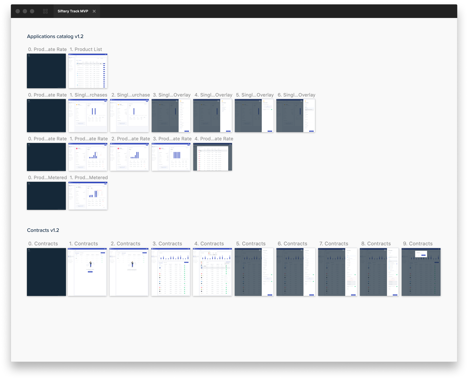
Our team ran a 2-week workshop to generate as many ideas as possible. The goal is to visualize the longer-term vision while narrowing down our feature list to reduce complexity. We eliminated "nice to have" features that are not technically feasible for early releases by prioritizing high impact and low effort functionalities. I pushed forward an MVP version while keeping in mind the system as a whole.


App architecture
Our engineers and developers worked in different time zones (India and Ukraine); not every team member attended our white-boarding sessions. To gain consensus with our teams abroad, I created wireframes and mapped out the app's architecture to help the team visualize where our core features live within the broader system. I reviewed our concept with our data scientist to determine whether we have sufficient data we intended to display.


Design critique and feedback
Once we finished tweaking our IA, I started pushing out prototypes on Figma to We continued to iterate and challenge our assumptions in order to ship a solution that is efficient, intuitive, and feasible.